The Best Dental Billboard Advertising Ideas

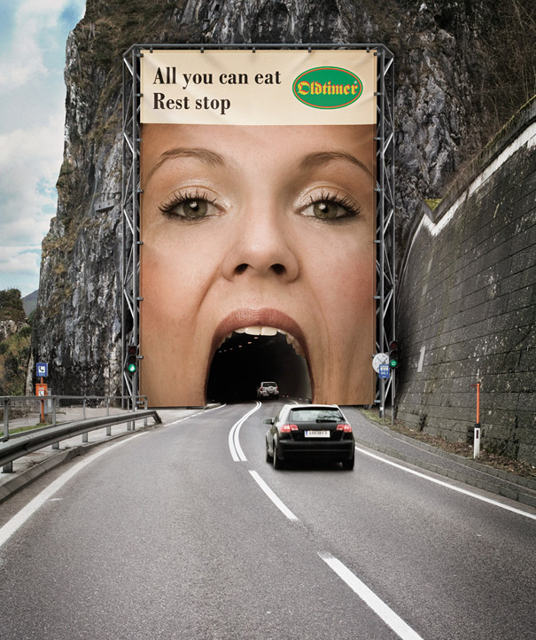
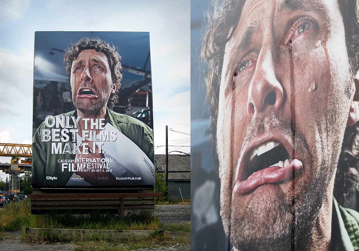
Everyone needs a dentist at some point in their lives. That being said no matter where you live, odds are there are a large number to choose from. Dental advertising is a very tough and competitive space to try and get the message and brand across to potential customers. That being said, when the going gets tough, the tough get going, and some dental offices have used humor, creativity, and a number of other ways to utilize outdoor media to their advantage. Here are some of the best dental billboard advertising ideas we’ve seen around.

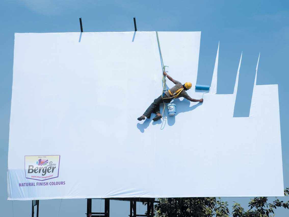
Whitlock Dental: Getting Some Work Done

Whitlock Dental Billboard

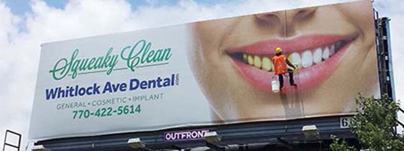
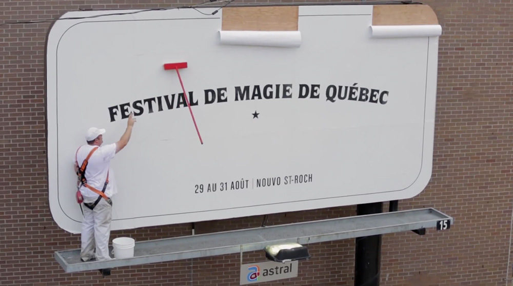
Billboards which use dummies dressed up to look like people can be an incredibly effective tool at getting the attention of drivers. Most people are not very used to seeing crews working on installing a new billboard. This means that when a driver does indeed catch someone working on a billboard it catches them off guard, even more so when they realize that the person’s actions are actually in line with the billboard.

Here of course, the message is supposed to demonstrate that the whitening offered by Whitlock Dental is as easy and effective as painting over a billboard.

Coast Dental: Fill In The Gaps

Braces Dental Billboard

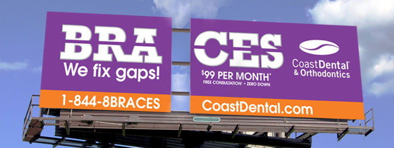
Speaking of catching people off guard and making them feel uncomfortable, here is another billboard which aims to do just the same. When one looks at a billboard, they expect to see one continuous image. The gaps in this billboard defy the expectations of the viewer and thus catch their attention. More than that however, a desire to fix the gap in the billboard is created within the viewer. Those needing braces or who know others who need braces will ideally end up connecting these two thoughts together.

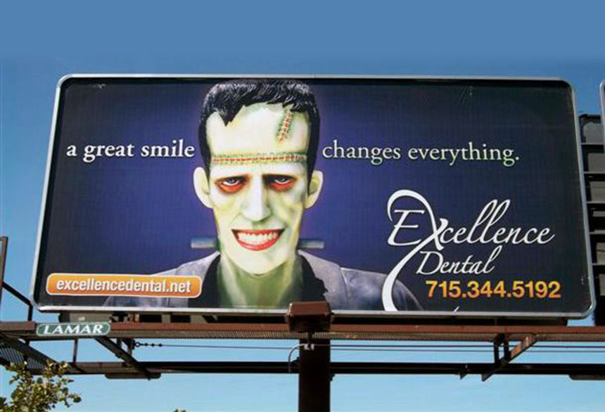
Excellence Dental: Monster Mash

Excellence Dental Billboard

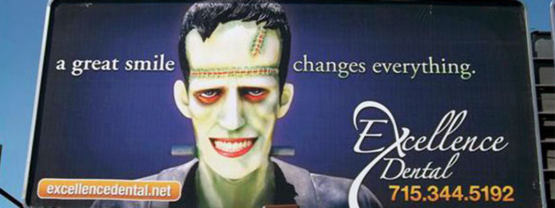
Frankenstein’s monster is a classic and memorable pop culture icon. Regardless if one is familiar with the source material, it is highly unlikely that they aren’t familiar with this giant green abomination. By editing this well known character Excellence Dental is able to grab the attention of drivers who will recognize that something is off.

This is coupled with the clever play of words in the ad, “A great smile changes everything.” While in the context of the ad it is meant as, “a great smile can make you feel more confident,” it takes on a secondary meaning in that “this thing added to something else makes it look very different.”

Rhoads DDS: Scrubbing Away Filth

Best Dental Billboards

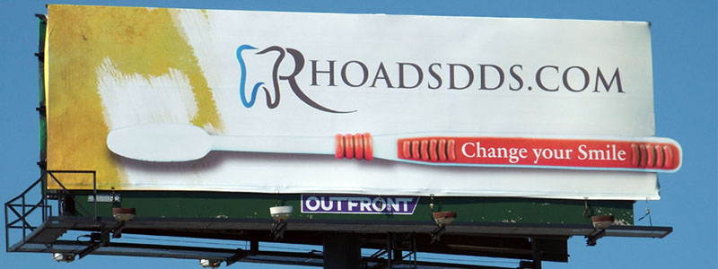
While many probably remember being told to color inside of the lines during kindergarten and elementary school, this isn’t always the case in the world of professional graphic design and advertising. Thinking outside the box, literally in some cases, will lead to gripping and visually interesting ad campaigns. This ad may not be as exciting as some of the other selections on this list, but in its subtlety lies its brilliance. Having the toothbrush just ever so slightly extend past the borders of the billboard adds a necessary level of dynamism to the ad.

In addition to this, the ad’s use of color is striking and does much to convey its message. The absolutely filthy yellow and the texture used on it creates a sense of unease in the viewer which is then contrasted with the beautiful pure white background that the company’s logo sits on.

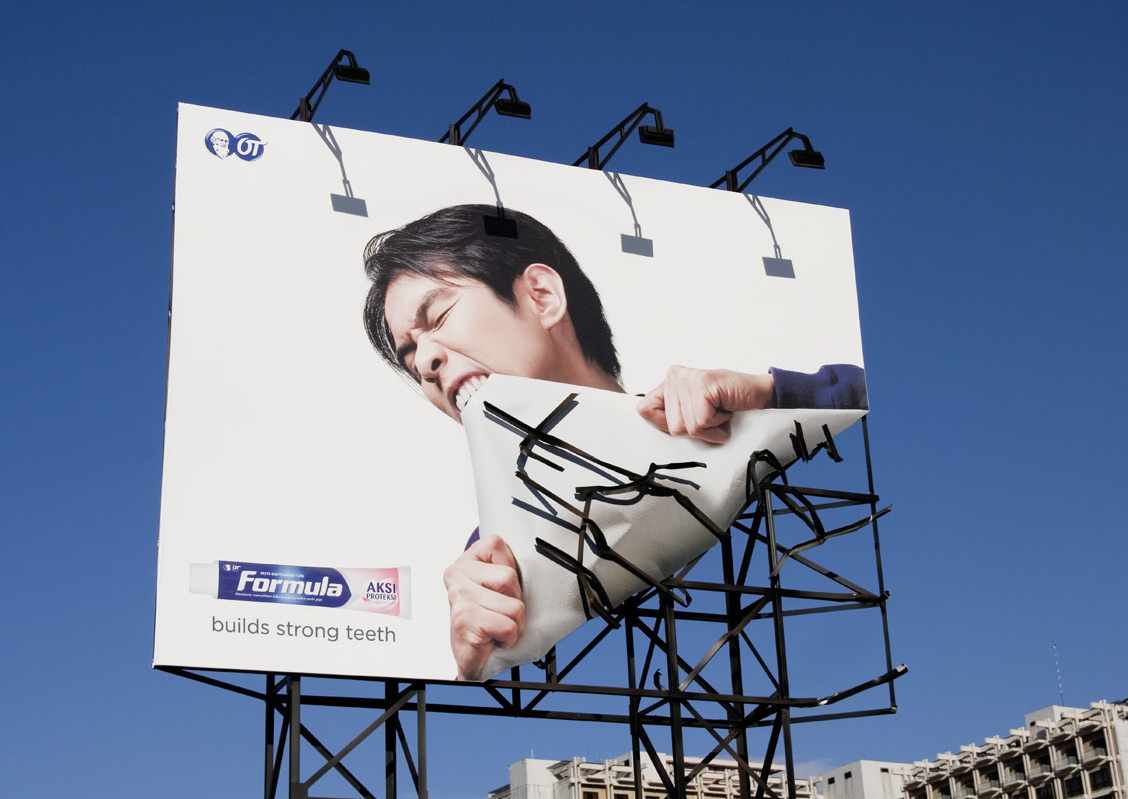
Community Dental Care: Billboard Destruction

Best Dental Billboard Advertising Ideas

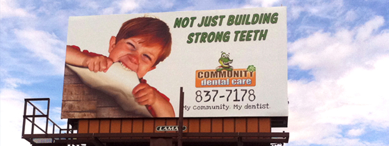
As previously demonstrated- breaking the “fourth wall” is an effective way of grabbing the attention of your audience. In this case we have a billboard which utilizes two different backgrounds to give the impression that a child is actually eating the billboard.

Given how seemingly bizarre and difficult this task would be, this advertisement is able to use this exaggeration in order to get across the idea that they help build strong teeth. The text goes out of it’s way however to make references to other services, of which are implied just to be as effective as the teeth strengthening.

Center For Dental Implants: Bite This

Bite Me Dental Billboard

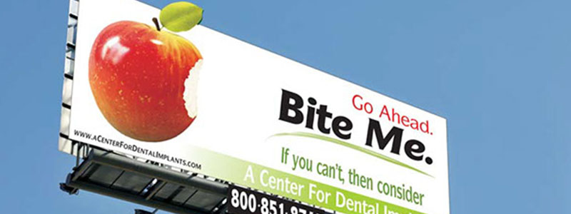
Perhaps one of the more unique examples here, this billboard actually doesn’t feature any images of teeth or dental products on it. Instead it attempts to paint a vivid mental image in the viewer’s mind of them biting into an apple.

It uses this as a sort of filter in order to connect with its target audience. Those that imagine biting into the apple and enjoying it are essentially disqualified from the offer. If the viewer however were to imagine going through pain or difficulty then the billboard has found someone who stands to benefit from their service. It reminds these viewers of the pain they experience and offers a personal and relevant solution to them.

The Best 3D Billboards

Especially in our era of digital media, advertisements which utilizes real-life 3D space are often overlooked by creative agencies. Billboards offer advantages and freedom that other mediums such as banner ads won’t be able to compete with. Here are some of the best and most creative examples of 3D billboards from a variety of companies and industries.

Donatos Pizza

Donatos 3D Billboard

The most impressive part of this billboard is the fact that they’ve actually teamed up with another advertisement. Consumers are used to advertisements competing with each other, each in their own little separate pieces of the world. When two advertisements end up crossing paths like this the result is an unusual but unique synergy which ends up benefitting.

It doesn’t stop here though, Donatos has actually teamed up to do similar ads for their pizza with other brands. The fact that they were able to coordinate this level of cross promotion not just once, but multiple times, is astounding.

Hairclub

Hair Club 3D Billboard

Compared to some of the other selections on our list, this ad doesn’t necessarily push the boundaries of what can be done with 3D billboards. Compared to lavish and impressive set pieces on some of the other billboards, this ad’s simplicity shows that creating an effective 3D billboard doesn’t necessarily require a huge budget.

Quitplan

Quit Plan 3D Billboard

If one were to take a moment to really look at the actual graphics of the billboard, they would quickly realize that it is comprised entirely of some plain text on top of a colored background. It seems like a lot more is going on here thanks to the 3D cigarette butt under the sign, but this billboard is the picture of simplicity. The majority of the ad is actually in the cigarette butt itself- the sign conveys the information it needs to convey but the eye is naturally drawn to the cigarette due to the contrasting light color compared to the billboard.

Galavant

Galavant 3D Billboard

Cars and planes “breaking through” the billboard are a commonly recurring theme when you look at many 3D billboards. A horse however is a new spin on the old formula. While the visual interest and excitement of something approaching the audience is still there, the horse, night, and fantasy environment aren’t something people are as used to seeing and make it stand out.

Fallsview Casino

Fallsview 3D Billboard

There’s a certain magic about big things that shouldn’t be big and small things that shouldn’t be small. When we end up seeing something that isn’t the size we’ve come to expect, it invokes a sense of wonder and giddy. This concept is used frequently in film and many amusement parks to great measure. Thus, the concept of making a giant ad out of a small commonplace object does well to capitalize on this idea.

The Peanuts Movie

Peanuts Movie 3D Billboard

While most other “crashing through the billboard” ads simply stick out the front of a thing, this one goes a step further and actually makes it appear to destroy the ad. Similar types of ads also don’t usually have a good reason for the subject of the ad to be coming out the front- what is it moving towards? Those familiar with The Peanuts series of comics and cartoon shorts though will recognize this billboard as a small recreation of one of the more famous strips. Even for those not familiar with the brand, it’s still visually interesting and does a good job of conveying a sense of excitement about the movie.

Absolut

Absolut 3D Billboard

Ever gone to a furniture store just to get inspiration from how they’ve set up their mockup living spaces? There’s something cool about seeing dioramas, how perfect and frozen in time they appear to be. This Absolut ad invokes the same spirit while also adding in a different layer of visual interest, the 90 degree angle of the furniture.

Much like a piece of art conceived by MC Escher, the rules of gravity just don’t seem to work the same way on this ad. Drivers will inevitably be drawn to the piece out of curiosity and wonder, thus inadvertently exposing themselves to the Absolut brand.

15 Most Creative Billboard Ads

Anyone who’s ever driven down the highway can tell you that not all outdoor media is created equally. Some fail to stand out, most are straightforward and simple. But there are a select few creative billboard ads that really make an impression – and those are the ones that we want to learn from. There has been much discourse in the past about what makes a “good” billboard. However, it might be easier to look at some of the most creative ones to see what really makes a billboard stand out from the rest.The first two ads we’ve got show the importance of utilizing the surrounding area. Sure, you could put a plain advertisement on a billboard just about anywhere. But if you’ve carefully chosen your location, you can make great, creative billboard ads like the ones below.

1. Berger’s “Sky” ad.

This outdoor media is optical illusions 101 – it uses careful framing to create a surreal image. In this case, it makes the viewer think a man is painting the sky. You might be too surprised the first time to absorb the brand, but you’ll look more closely the next time you pass.

Bergers Sky Creative Billboard Ads
(Image Source: Ads of the World)

2. Koleston Naturals’ Beachside ad.

Koleston uses a bit more of a straightforward approach here. The advertisement is clear to see, but the clever use of scenery and lighting makes it much more memorable.

In the vein of advertisements that make smart use of space around them, there are some ads which work almost exclusively due to the perspective they’re viewed from. Such ads can only be used in limited ways, but they’re doubly efficient for their specific placement.

Koleston Billboard Advertisement
(Image Source: Ads of the World)

3. Frontline’s Floor Tick ad.

This neat advertisement from Indonesia utilizes the pedestrians themselves as part of its advertisement. The pedestrians could probably look down for a moment and figure it out, but the true viewers are the ones looking from above. If you are one of those viewers, this ad will really stand out.

Frontline Floor Tick Billboard Ad
(Image Source: Adpressive)

4. Oltimer’s Tunnel ad.

A fairly unsettling billboard, depending on your sensibilities. But it’s no less effective or impactful: you definitely get the idea. This ad uses the cars as part of the advertisement, just like the tick one, but in a much more direct way.

Oldtimer Billboard Ad
(Image Source: Boredpanda)

5. Red Cross Earthquake Illusion series.

Not just a single ad like the others, this was part of a series of billboards made by the Red Cross to help advertise the importance of earthquake preparedness. Whether or not it greatly improved public safety is hard to say, but it was certainly a great stroke of advertising prowess.

For those who are willing to make it happen, you can find great success with adding special effects to your billboards. All the ones we’ve looked at so far were plain, but well-planned advertisements. Now let’s look at some that use extra effects to get the point across.

Red Cross Billboard
(Image Source: Moillusions)

6. Smoking Mustang ad.

It’s hard not to look when you see smoke in the air – something Ford knew all too well when they put out their smoking Mustang ad. This billboard uses periodic puffs of smoke from the wheel area to draw attention to a faux burnout– talk about an eye catcher!

Ford Mustang Billboard
(Image Source: JasonIRosenberg)

7. Avera’s Smoking Car ad.

In contrast to the Mustang ad, this billboard uses smoke to draw attention to the scene of a crash. This makes the idea of the Avera medical support seem extra dramatic. After all, car crashes are the exact kind of sudden occurrence that makes insurance so important.

Avera Creative Billboard Ads
(Image Source: Boredpanda)

8. Cannes Crying ad.

This ad uses two simple nozzles to create a crying effect on the billboard, in addition to the actual tears shown in the picture. It’s plain, and probably easy, but it has a charming effect once you notice it.

On the topic of the liquid using crying advertisements, there have been a few billboards from different companies that are set to react to the rain. These may or may not include actual liquids being used.

Cannes Crying Billboard
(Image Source: Ads of the World)

9. Calvin Klein Wet Nightie ad.

It’s no secret that sex sells. And what could be better for the rain-distracted driver than this sudden, titillating display? Disregarding any potential concerns of distraction, there’s no way this ad will go unnoticed when the rain comes down.

Calvein Klein Billboard Ad
(Image Source: Boredpanda)

10. Max Factor’s Running Mascara ad.

Max Factor isn’t here to sell you any big claims about waterproof mascara. This is normal mascara, plain and simple – the billboard is just there to get your attention once it rains. It works.

Max Factor Mascara Billboard
(Image Source: Boredpanda)

11. Papakura’s Bleeding ad.

Papakura’s district council in New Zealand has had enough of unsafe driving, and it shows. This hard-hitting (and questionably appropriate) advertisement puts the consequences of reckless rainy driving in perspective by leaking red fluid whenever it rains. Harsh, but effective.

Speaking of harsh, billboard advertising isn’t always fun and games. Sometimes, you can use the space of a billboard to address a really serious matter.

Papakura Bleeding Billboard
(Image Source: Boredpanda)

12. Escape Abuse ad.

The impact of this creative billboard ad makes it hard to add anything to the discussion – it really speaks for itself. Absolutely visceral through its simple presentation, with the addition of a bedsheet rope to accentuate the point.

Creative Billboard Ads
(Image Source: Ads of the World)

13. Speeding Consequence ad.

Almost everybody looks at the speed markers on the side of the road. Some of us, to adjust our speed, and others, to see how much more we can push it. But regardless of how you drive, this advertisement is sure to grab your eye.

The last surefire way to get eyes on your billboard is by investing in an additional prop. This might mean designing the board differently, or perhaps establishing a whole prop in front of it. Here are two great examples of the technique:

Consequences of Speeding Billboard
(Image Source: Ads of the World)

14. Formula Billboard Bite ad.

This billboard is another simple, effective one. You know exactly what it’s saying: Formula gives you strong teeth! All it takes is a little creative design on the billboard, and your ad can be just as concise.

Formula Bite Billboard
(Image Source: Ads of the World)

15. Backseat Ejector ad.

If you’re passing by this ad too quickly, you might miss it. But once you see it completely, it’s quite a powerful message. So powerful, in fact, that the Colorado Board of Transportation faced some flak after putting them up. Controversy means it worked, though; people definitely talked about it.

Backseat Ejector Billboard
(Image Source: Boredpanda)

The Best Creative Billboard Ads

As you can see from this list, the best billboards are those that escape the “extra-big, but otherwise normal advertisement” way of thinking. This can be done in a variety of ways: by using props, by using clever staging, or even just good design. If you think that putting water nozzles on your billboard will help, it can probably be done, and the interest you generate will often be more than the effort it took. Consider the location of your billboard and the nature of your brand; the possibilities are endless when it comes to billboard advertising.

Funny Billboard Mistakes

Outdoor media has always been an industry filled with creativity. We live in a world where most people witness thousands of advertisements every single day, so being different and cutting through the noise is crucial for anyone who wants to get their message across. Humor is often an angle advertisers take to reach potential customers. Sometimes it’s intentional and other times it’s not. We’ve put together a list of our favorite funny billboard mistakes.

A Senior Citizen Washing and Vacuuming Service

If this was an actual service someone was offering- we wouldn’t be too surprised. The price seems about right as well.

Outdoor Media Mistakes

Bye Used Cars

This one stands out so much that we almost want to believe that it was done intentionally. Think about it- you’ve got a used car and you want to get rid of it, where do you go? Here I guess, because they’ll make that car go bye?? Even if it’s not a horrible misspelling, it’s a terribly forced pun and we aren’t sure which one is worse.

Bye Used Cars

Eccept the Challenge

I’m hoping this was the result of “let our students change the marquee” day. If not then this elementary school has probably very few future spelling bee champions…

6

A Really Bad Billboard

Not only is there major issues with the grammar and spelling of this billboard, but it’s hard to understand the purpose at all? From a poor clipart design, to the irony of it all, we just don’t really know what to think about this one…

7

A Mistake on Pupose

One has to wonder whether the banner on the bottom was added after the fact or whether this was done intentionally. We missed it the first time too…

Funny Billboard

Stealing Letters

Imagine needing to update a marquee with a new discount or offer, only to find out that you don’t have the letters you need. Now imagine having that happen again and again.

Funny Billboard Errors

S p a c e  O u t  F o n t s

Font spacing can be very important. This billboard looks a bit different from a distance…

Funny Billboard Problems

Spelling Problems

This might not be the best school to go to…

Funny Billboard Mistakes

Another Purposeful Mistake

Unless you’re bilingual in English and Chinese this playful billboard is a good example of a mistake on purpose.

Funny Billboard Errors

The Fast Food Marquee

While the branding of the signs themselves are always carefully managed by corporate and contracted out to professional design firms, the marquees that go under them are left to the local management. This results in such gems as this Wendy’s marquee. Bonus points to the hiring request adding even further unintentional humor.

Outdoor Media Errors

A Billboard of Coupons from Burts Bees

In October of 2012, personal care products company Burt’s Bees created a unique interactive billboard campaign for their new Intense Hydration line. The billboard is not your typical billboard; Burt’s Bees got creative, redefining billboards and how customers interact with them. As a result, the campaign was quite successful. What was the Burt’s Bees Intense Hydration billboard campaign all about, and what made it so successful?

Burts Bees Billboard

Background

Instead of showing a side by side comparison of the same woman before using the Intense Hydration skin line and after, this campaign gets a little more creative.” — Meghan Young, trendhunter.com

The campaign takes place along the busy street life of Minneapolis, where Burt’s Bees had decided to construct a billboard using thousands of coupons. This requires the team to attach each coupon to the board one by one; when put together, the coupons show the image of a woman with dry skin. After the billboard is done, the crew sets it up on a busy street.

Once the billboard is up, several curious passersby stop at it and peel off coupons over the course of the day. As the coupons come off, the billboard eventually reveals a different image of the same woman underneath, now smiling and with a more vibrant complexion, obviously happier than before, presumably in order to show the intended effect of using Intense Hydration products. Why did this campaign get such a positive response?

Burts Bees Coupon Billboard

1. It takes a unique approach.

In the past, Burt’s Bees also worked with its agency Baldwin& to celebrate Earth Day with a unique “music video” that incorporated sounds of several common ingredients found in Burt’s Bees’ products.

For starters, Burt’s Bees reimagines the typical, run-of-the-mill advertising campaigns and gets creative, doing what other players in the industry haven’t done before. People tend to get desensitized to predictable, generic marketing strategies and tune out anything that’s ordinary. Burt’s Bees makes a memorable impression by taking the boring old “before and after” and adding a unique element by using detachable coupons to show a gradual transition from the “before” to the “after” stages instead of showcasing a simple static side-by-side comparison or something similar.

2. It engages and rewards other people.

Burt’s Bees uses their billboard to interact with actual people, helping to boost the campaign’s message.

Traditional billboards are rather passive and one-sided in their communication, expecting nothing but for people to stop and read the billboard. After Burt’s Bees’ team members put together the billboard in an interactive way (read: setting it up with a layer of detachable coupons), they get actual people to interact with their advertising, peeling off the coupons and eventually showing the result. Getting real, genuine people to interact with the billboard strengthens the campaign’s message as well as rewards these individuals with $3 discount coupons, in this case.

Billboard Burts Beees

3. It shows, not tells.

Burt’s Bees lets their campaign show consumers the potential of their product instead of merely telling them about it.

Far too many brands market their products in a way that merely tells the audience how great their product is, instead of actually showing it. Burt’s Bees sets up a superb unique before-and-after demonstration that sends a powerful message effectively without needing to fill the billboard with superfluous information. Not to mention that the coupons Burt’s Bees used were printed on post-consumer recycled content and the billboard they used was printed on recyclable nylon. This eco-friendly position, even behind the scenes, sets a stellar example and aligns with Burt’s Bees’ dedication to using all-natural products.

After the campaign, Burt’s Bees released a video that shows the creation of the billboard and the actual campaign in action.

Using Magic in Billboards

Advertising is often thought of as pretty straightforward, and it can be tempting to follow boring formulas to try to get your message across to consumers. But, there’s one thing that many people forget: advertising can be magical! When making an effort to push the limits of what’s possible, you might just be surprised at the results you’ll get.

Are you not convinced? Then just keep reading to see how one group said some magic words on their billboard, and really got noticed because of it.

Magicians Need Advertisements Too

There has been a magic festival held in Quebec over the past few years. In order to prove their entertainment value, they always seem to come up with some impressive ads that are much more than just a poster on the wall.

One of their most spectacular was a billboard that… Well, you should see for yourself. Watch this video before reading on.

The Magic Behind It

As the video shows, an average man was using a big mop to plaster up a straightforward sign about the show, but then things took an exciting turn. As the mop continued to work while flying through the air, many stopped to watch and be amazed.

Fortunately, or unfortunately, the video revealed the trick. It’s not actually magic (sorry). There was an elaborate system on the back that pulled the mop around using a chain and magnets, but made it look from the front like it was the result of magic actions.

Starting the Performance Early

True magic or not, this was really a preview of the show that they would offer. The festival is all about entertainment and allowing people to suspend their belief of reality in order to appreciate something spectacular, and they managed to prove their offerings before anyone had to pay for a ticket.

Essentially, they gave a free sample, and all they needed was a billboard to do it.

Simple, Well-Delivered Message

A good billboard drills everything down to one clear message and this one managed to do that.

Magic!

There wasn’t any extra noise on the sign screaming about headliners or where to read the program. In fact, it was extremely minimalist. It said the name of the festival, the date, and the location. Nothing else except for a little star.

Anyone viewing it would quickly realize that if they wanted to see more (probably better) magic tricks, this festival was the place to be.

Not the Only Trick Up Their Sleeve

True to their roots as magicians, they made sure that this wasn’t the only time to wow an audience. They’ve worked with the Ig2 agency over the years, and they’ve had quite a few impressive campaigns.

In one, they looked like they were too lazy to create much of a poster, but it turned out that they needed a little help from the audience (some were even rewarded for their efforts).

Another installation in a bus stop put the power of magic in the hands of people waiting for public transit – no magic wands required.

Couldn’t Be Done Digitally

This is an interesting example of advertising in our modern times because many people are turning towards making elaborate digital displays. This is something that could have quite easily been animated, but then it never would have been so impressive. It was completely dependent on having an actual man and a physically flying mop finishing up a billboard of real material.

That doesn’t mean that it had to remain out of the digital world, however. Many of those who saw it took photos and videos, and those will spread like wildfire on social media. Plus, a nice case study video like they created will let it live on long after the sign has been taken down – and people will still be interested in watching it.

Encourages Curiosity

Another benefit of this is that it makes people wonder how it happened. That’s the most common question at a magic show, and anyone who can’t figure it out is likely to share it with their friends to try to help solve the mystery.

Magicians don’t always want to reveal their secrets, but it was a good choice to do so in this video. Knowing how it works really convinces people of its authenticity, and that makes it all the more impressive.

Quebec Magic City Festival Billboard

Many Ways to Build Billboards

Another takeaway from this is that there are always more creative ways to build billboards. The digital age is pushing us toward signs that interact with people using complex systems and digital displays, but doing something like this can be just as creative.

Mystify Your Audience

Do you have any clever ideas to give your customers a sample of your work while also keeping them entertained? If so, we’d love to help make them happen!

Using a Billboard to Find a Job: EmployAdam.com

No matter what state the economy is in, getting a job is always more challenging for young and inexperienced people than it is for those who have been working in their field for a number of years. Without a solid resume and some good connections, many turn to creative options to get noticed. There are many urban legends about different strategies that have worked over the years, but one man really took things to the next level with a plan involving a billboard.

Employ Adam Billboard

Adam’s Story

Adam Pacitti spent far too many months filling out a ridiculous amount of job applications, but he just wasn’t having any luck. It caused him to realize that he was going to have to try something a little bit out of the ordinary if he wanted to get noticed over all the other applicants, and he wasn’t afraid to invest some time and money in making it happen.

Instead of printing out more resumes, Adam had a billboard put up.

It had a noticeable blue background, a photo of him, and a simple sentence. “I spent my last £500 on this billboard, please give me a job.” At the bottom, he left the web address of how to get in contact with him: EmployAdam.com.

He was looking for a job in the media, so this use of clever advertising was a good idea. Among other things, the website contained a very well put together video resume explaining why people should hire him.

The Results

The good news for Adam is that the gamble worked. After the sign went up, he was flooded with emails and social media attention as it spread around the internet. It led to receiving plenty of job offers, and he agreed to accept one form a production company called KEO. His job was to promote their projects and to work on a series where they help job seekers come up with innovative ways to get hired. It sounds like it was a perfect fit.

The Billboard: Part 2

Being a true promoter at heart, Adam didn’t let things stop there. He went on to commission a second billboard to update his fans about what happened. The second one was very similar in style and image to the first, but this one said: “I spent my first wage packet on this billboard, thank you for helping me.”

Again, it contained a link to his website. It seems he was happy with his job, but he wanted to make sure to keep his options open.

The second sign also received a ton of attention, so it really kept his momentum and story going.

Employ Adam Billboard 2

A Lot Can be Learned from Adam

This whole situation is a great example to show how a wide variety of goals can be achieved with billboards. They’re not just for global corporations who have extra money to spend on additional promotions, but they can even work for very small organizations or individuals will straightforward goals.

Before making a billboard, it’s a good idea to use some of the same strategies as Adam.

A Clear Goal and Message

One of the main reasons this sign was so successful is that Adam had a clear goal before he started (get a job), and he got his simple message across easily (hire him). Billboards generally should avoid trying to solve more than one issue, and they should act as a step in larger campaigns. Adam’s did that by giving a very obvious call to action, and everyone knew they just had to visit his site to see more.

Proved His Value

Wanting a job as a media promoter really made this billboard a continuation of Adam’s brand. Not only did it show off who he was, but it proved he could do the type of job he wanted. It was a funny, entertaining, and well-made piece of media. In other words, for Adam, it was a resume and a sample of the kind of work he wants to do.

Where is Adam Now?

Adam now works for a media company called WhatCulture, and he has been very successful there. He has also become well-known for making documentaries and online entertainment about professional wrestling, so the story really has a happy ending.

Don’t Be Afraid to Be Like Adam

Even if your goal isn’t to get a job, taking a page from Adam’s playbook may be a good idea. The billboard wasn’t the only step in Adam’s search for employment, but the other methods he had been trying were unsuccessful until he created the sign.

Is there any part of your marketing strategy that’s also missing one key ingredient?

Are You Fast Enough? Reebok Running Billboard

In the world of marketing promotions and giveaways, not all are competitors are equal. Prizes and discounts are given out for many reasons, and it’s a popular strategy to grow a business. Some giveaways want to generate buzz, others try to get customers in the store, and some even just try to clear out old merchandise.

But, there’s almost always a better strategy for business promotions then just randomly picking a person and handing them a gift. It takes time and effort, but it can really bring rewards.

One promotion in Sweden used a billboard as part of the process, and the whole situation really got some hearts racing.

Reebok Billboard Are you Fast Enough?

The Reebok Running Billboard

The billboard we’re talking about was assembled on a crowded shopping street in Stockholm, Sweden. But, instead of just being images and text, it basically looked like a display case full of locked plastic boxes housing the new ZPump 2.0 shoe model.

And, customers could win it.

There was a speed camera set up on top of the sign, and it would track exactly how fast people were running as they went past it. It had a digital display to show the number, and they were trying to top 17 kilometers per hour.

If they were successful, a green light would turn on, and they could open a box to take out a shoe. If not, a red light sadly announced their defeat. The winners could trade the shoe in for their own size of the new model.

Encouraged Them to “Be More Human”

The relatively new tagline of Reebok is “Be More Human,” and the whole point is to show that people get scrapes, worn out shoes, and much more when they’re pursuing strong fitness goals. It encourages them to push themselves to their limits, and embrace the pain along the way.

It’s a brand that’s really been working to reinvent its image, and this sign matches with it perfectly. People don’t just get handed something, but they have to earn it. And, they don’t do it on an athletic field under perfect conditions. Instead, they do it in an everyday situation where they may or may not be wearing running shoes (it’s a lesson to always lace up the Reeboks in the morning!).

Winning Works in This Industry

The industry that houses fitness clothes and running shoes is fast and exciting, and it’s basically powered on adrenaline. Companies in this area have long known that hosting and sponsoring events and competitions will get them noticed. They slap their names on marathons, get their logos on sports teams, and make sure famous athletes mention them at the same time that they win something.

They need to be associated with successful sports, and it really helps if their name is directly attached with a competition. But, nothing’s better than customers remembering the feeling of winning when they think about a fitness brand.

Are You Fast Enough Reebok Billboard

Customers Are Competitive

Some people run because they want to lose weight, others because it relaxes them, but most simply run because they have a competitive nature. The message that this billboard conveys fits right into that, and it doesn’t even need the costs and challenges of hosting a major event to make it happen.

Plus, it works from another monetary point of view. Prizes are only rewarded if people participate, so there’s no risk to hosting it.

Using Technology With Billboards Is a Plus

Billboards are a very old advertising medium, but technology has carried them directly into modern times. Technology isn’t required for great billboards (some of the all-time greats were very simple), but it’s a great way to add interaction. Without some sort of innovative feature, people are just viewers of signs. But, when they become more involved with the billboard, they feel like they’re part of something and become more loyal to the brand.

Don’t Go With a Gimmick

Before you start to think about interactive electronics, keep in mind that one of the risks of exciting technology is the temptation to make something just because you can. This Reebok sign kept with a common theme that they like to portray, and that’s what made it so great and memorable. The difference between a gimmick and a brilliant idea usually just boils down to how relevant it is to the brand.

Let’s Run Together!

Whether you’re a running shoe company or not, there are some clever ideas like this one that your organization can use. We’ve helped plenty of businesses create their masterpieces and pass the messages to their customers, and we’re eager to keep pushing the limits. Get in touch, and we’ll run through your ideas together!

https://www.youtube.com/watch?v=bXDCJQqodj0

McDonald’s Put Up a Billboard for Burger King

Billboards are a classic site alongside roads throughout the world, but most of them are fairly similar. They have roughly the same dimensions, don’t contain too much information, and are designed to get a simple message across to people who won’t have much time to view it.

On the other hand, quality billboards go much further. They follow a strong strategy, and they’re put together in a way to be very memorable. Some even go to extreme lengths to make them unique enough that people want to talk about them.

Some advertisers in France recently decide to go big with their sign, and it caught the attention of plenty of people.

McDrive Billboard

Directions to a McDrive

This situation is unique because the billboard was put up not by the company it was advertising, but by its competitor. The sign was a giant ad giving directions on how to get to the nearest Burger King, and it happened to be 258 km away. But, they did it because they could put a sign next to it showing the distance to the nearest McDonald’s, and it was only 5 km away.

This whole little plan would’ve worked without any spectacular show, but it wouldn’t have received the major attention it ended up getting without its unique aspect. The billboard showing the major distance to Burger King also included the directions that a GPS would give drivers, so the BK sign was about 10 times taller than the McDonald’s ad.

Getting the Message Across

It may seem like a weird sign for a fast-food chain, but these two billboards really communicated the main message that McDonald’s wanted customers to know.  There are around 1,000 drive throughs with golden arches on the sign, but less than 20 with a king advertising the burgers. So, rather than making people think the food was tastier, the prices were better, or any other value they’ll receive while eating there, McDonald’s wanted to remind customers how much more convenient it is to swing by one of their restaurants. This was an unusual way to show it, but sometimes that’s what it takes.

Mcdonalds vs Burger King Directions

The “Wow!” Factor

There are a lot of ways for billboards and other ads to be interesting enough for people to talk about them. Sometimes they make use of extremely advanced technologically, so they’re a conversation topic because people are impressed. Other times they somehow solve a problem that people face in their lives, so they’re interesting because of the good they do.

In this case, the billboard was talked about because of how ridiculous it was. It didn’t have any fancy technology, and it hardly had anything pretty to look at. It didn’t do anything new, and it definitely didn’t solve a problem (it’s unlikely anyone would actually use this as their key source of information on how to get somewhere so far away). Instead, people liked it because it was so dramatic. It was funny and silly, and yet it still made the point.

Risks of Mentioning Competitors

Another tricky situation involved here is mentioning the competition. When planning your advertising, this is an important thing to decide about for a few reasons. First, you need to find out what legal restrictions you face. A small mistake could cause you to end up with a costly lawsuit, and that’s not usually worth it.

More importantly, this gives direct advertising for your competitor. Everyone knows that these two chains are against each other, but some companies need to be careful about helping customers realize that other organizations offer similar products or services. Plus, if you’re too mean, it can leave you with a negative impression in the eyes of some customers.

Creative McDonalds Billboard

Outside-of-the-Box Billboards

When designing a billboard, it’s a good idea to get a little creative with the style. Remember that you don’t have to be old-fashioned and boring with what you make, and creating something that looks different from all the other signs on the road can really help yours stand out.

The Product Doesn’t Have to Be There

Another good lesson to take from this has to do with the content of the billboard. They generally need to have less information since many people see them but for only a short amount of time, so it’s a good idea to pick only one message. And, it doesn’t have to be about your product. McDonald’s does a lot of marketing about its food, so sometimes they can highlight other values that they can offer to customers – such as convenience.

Want to Make a Billboard that Stands Out?

We love working with creative ideas for our billboards, and we’ll be happy to take on the challenge of something exciting you’ve come up with. Even if you don’t want to build a tower giving directions to your competitor, we can help make your idea a reality.

A Billboard that Coughs at Smokers

Doctors used science long ago to prove that smoking is an extraordinarily unhealthy habit, and it can lead to a large number of medical conditions. Also, it’s expensive, causes damage to buildings, bothers others, and has many other negative effects.

Even with all of these reasons to stop smoking, people still do it. A lot of people. Why? Because it’s very addictive.

Anti-smoking advertising has been going on for quite some time, but maybe a new strategy will help. After all, it’s quite embarrassing when a sign gives you a hard time while you’re walking down the street, as one in Scandinavia just did.

Anti Smoking Apotek Billboard

Creating a Coughing Billboard

One of the most creative anti-smoking signs ever created was recently placed in a busy square in Stockholm, Sweden. This location was chosen because it happens to be a place where many people go to smoke.

The sign itself was a digital display showing a simple image of a person in black and white, and the name of the business was displayed across the bottom. It’s the kind of ad you see all over the place, and you may not even register it above a subconscious level.

However, what you don’t notice while just looking at it is that a smoke detector is hidden inside of the sign. When a smoker walks by, the machine picks up on the smell, and the image changes to a coughing man. It’s a very clear message that the guy is bothered by the harsh smell of the burning tobacco. Then, it shows some ads for some common products that will help people quit.

Two Ads in One

This sign was done in such a clever way that a lot of people took notice. It was clear that it was reacting to the people walking by, and that unusual behavior led to some funny (and uncomfortable) reactions from the general public.

The whole thing was a creative plan that was well executed, but the creators didn’t stop there. They also had a film crew around to discretely make a video of people’s reactions to the sign, and that was entertaining in itself.

They shared the video online, of course, and this meant that it went from outdoor advertising to something that could freely spread around social media.

Anti Smoking Billboard

It Fits the Brand

It’s not uncommon to see stop smoking billboards created by governments or other non-profit organizations, but this one was made for a business. It was put together by the agency Akestam Holst, and they made it for the Apotek Hjartat pharmacy. When you think about it, it’s a perfect match for the brand. The purpose of a pharmacy is to help you stay healthy and live a longer life, and quitting smoking really contributes to that.

So, not only was it funny and eye-catching, but the billboard remained relevant to the messages that the company wants to put out.

A Reason for the Timing

Just as the location was chosen because it’s a place where many people light up, there was a specific reason of why they released it in January. This is the month when people are trying to follow their recently made New Year’s resolutions, and quitting smoking is one of the most common goals that people set. It’s also one that many people fail to follow through on because of how difficult it is. This is a fun, catchy reminder to help people remember what they’re doing, and it would still work in August, but it wouldn’t work as well without the extra timing element.

Coughing Billboard

Brand Building Can Benefit Society

This campaign accomplishes some pretty standard goals that companies aim for when investing in advertising. It helps their brand become known, increases sales, and gives updates about current products. However, it also takes things a step further by doing something that contributes to society.

From a business point of view, a pharmacy will probably be able to sell products to smokers and non-smokers alike, so it’s not like it’s chasing away customers. But, if they build the image of being a trusted friend and valuable member of the community, they might just end up with more customers (even those who have never been interested in tobacco).

It’s Not Just for Pharmacies

Hopefully this campaign will serve as an inspiration to you in more ways than one. It’s a clever example of how you can mix outdoor advertising with a viral video, and it’s another case that proves that signs aren’t limited to being one-sided, static images. On the other hand, it should be a good challenge for you to find some social causes that can help boost your business. You don’t have to be in a field related to medicine in order to do something positive for the world, and even a small amount of effort can be enough to help you win some customers.