So, you’ve set aside a budget for OOH (out-of-home) advertising, but you’re not quite sure how to design a billboard. Where do you start? What do you say?
Once you know who your audience is and what consumption habits they might have, you can choose the next step to create a captivating design and engaging content. Deciding what to say is a big part of it, however, how you say it is even more important. Bringing the ad to life so that your audience reads and retains the message is crucial. bMedia has narrowed it down to 5 key things to focus on when designing a billboard.
Simplicity Is Key
We’ve all heard the saying, “less is more.” When designing for moving targets, aiming for that is key for a successful ad. Try to make the message short and sweet. A good rule of thumb to go by when it comes to how to design a billboard is to use no more than seven words. Make your billboard contain only the essence of what you want your audience to retain.
A billboard that has one main message, with seven words or less, is much easier to read and absorb. While a billboard that has more text or content might contain useful information, no one has time to read the entire thing and there’s not a focal point. It’s an information overload, especially for someone who’s quickly passing by the billboard.
Consider Location & Season
This one is product specific. Meaning, after you choose the main point you would like to convey to your audience, consider where and when it will be most impactful. Is location relevant, and does the season timely to your message.
Make Use Of Space & Time
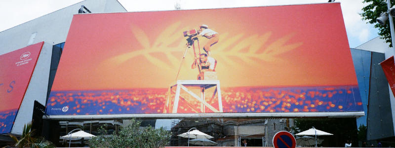
Ads are everywhere, meaning you are competing for the attention of the audience. They can be walking down the street, on the go in their car, or looking out a window in the office. Thinking about what your audience is doing will ensure they are able to capture the message. Maybe the message is portrayed with an image, which can be worth a thousand words. Images have the ability to make instant emotional connections.
This goes back to our first tip – less is indeed more.
The Three Cs
What are the three c’s you ask? Color, contrast, and creativity. A combination of these will help crank up the volume (or down, depending on the message).
Color
This will help evoke emotion. Choosing the right colors helps you send the correct message.
- Reds: love, hate, passion, and anger
- Blues: cool, flowy, calm, and relaxed
- Purples: status, royalty, and wealth
- Orange: excited, happy, energy, and vitality
- Yellow: hope, summer, and warmth
- Green: nature, health, luck, and finances
Contrast
Color plays a key role, but contrast rules our perception. Contrast, or opposing shades, is what will truly grab the attention. It helps organize the design and establish a hierarchy. The contrast in your design hints at what is most important by signaling what to focus on most. The text on our website stands out from the contrasting background, to bring your focus and attention to what we deem most important. It helps things stand out and really make an expression. There are several different ways to apply contrast to the design of your billboard:
- Size – contrasting sizes will have the design stand out more. Don’t go crazy here, though, too many different sizes can confuse your audience.
- Shape – contrasting shapes will have the eye focus on the one shape that doesn’t look like the others. Use this to your advantage.
- Color – See above
- Texture – A background texture brings depth to the foreground, therefore creating more contrast between the two. Texture also complements your message.
- Position/alignment – The rule of thirds in photography can be applied here, or the use of empty space.
- Saturation – Going back to color, having black and white and then a splash of color really helps your design and message stand out.
- Space – Consider space with your message, as space can help your message stand out. Especially in a minimalistic design.
Creativity
Now, combining both color and contrast in a balanced way is tricky – that’s where creativity comes in. Too much contrast can be confusing and too little color can be boring. There is no magic formula, however, there is a process to help ensure you use both correctly.
Typography
If you do use words, make sure they look good. The three main things to focus on are:
- Font
- Kerning
- Size
If you are going to put words on a billboard, its purpose is that your audience actually reads the message (not for decoration). Using a legible font like Sans-Serif will make the message easier to read. Placing the text is just as important, giving each word its place and purpose. Finally, size – don’t be afraid to go big if it is important. Not only does it make your wording more legible, but it also gives people more time to see what you are trying to say.
Billboard Experts
If you’re trying to establish a presence in Puerto Rico, bMedia has the expertise, professionalism, and locations necessary. They work hand-in-hand with seasoned experts to create stunning billboards. While creating innovative designs, they focus on what you actually need. That means putting in work on the details and ensuring high-quality aesthetics. If you’re still unsure how to design a billboard, bMedia can always give further guidance.